WPF Slider滑动条的颜色修改方法
更新时间:2020年6月25日 11:16 点击:1697
效果如下:

鄙人虽然开发WPF有些时间,但之前一直是一些简单Template和Style改改之类的工作,并没有深入研究过。此次为了完成工作,首先也是网上搜了半天,没有找到合适的代码直接拷贝(搜索能力待提高),干脆就直接静下心来琢磨琢磨。
一开始在界面上就放了Slider,挠挠头,怎么修改Template才能达到效果呢?后来想到了Blend,之前一直听说很强大的界面设计工具,但是一直没有用过,就趁此机会就简单运用了一下。Blend中很牛逼的就是编辑模板,通过创建模板副本,可以看到Slider结构
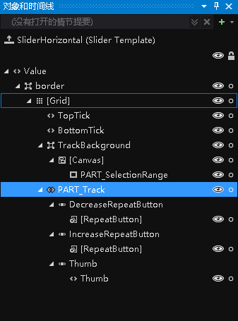
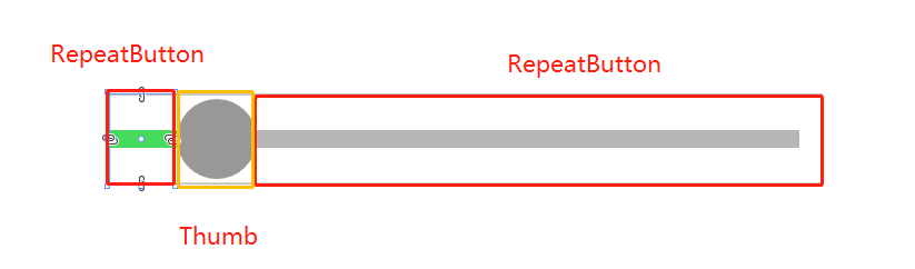
结合代码发现,Thumb左右两边的ReapeatButton的宽度会随着Thumb的位置会变化。那问题就变得简单很多,修改左RepeatButton的Template就可以达到目的,核心代码如下。
    <Style x:Key="DecreaseBtn" TargetType="{x:Type RepeatButton}">
      <Setter Property="Template">
        <Setter.Value>
          <ControlTemplate TargetType="{x:Type RepeatButton}">
            <Border Background="{TemplateBinding Background}"
                Height="{TemplateBinding Height}" Width="{TemplateBinding Width}">
              <!--轨迹,设置Background-->
              <Border Margin="0,0,-1,0" Background="{StaticResource SliderThumb.Track.DecreaseBackground}"
                  VerticalAlignment="center" Height="4.0" />
            </Border>
          </ControlTemplate>
        </Setter.Value>
      </Setter>
    </Style>
完整代码(只是考虑水平的Slider):
<ResourceDictionary xmlns="http://schemas.microsoft.com/winfx/2006/xaml/presentation"
          xmlns:x="http://schemas.microsoft.com/winfx/2006/xaml">
  <SolidColorBrush x:Key="SliderThumb.Static.Foreground" Color="#FFE5E5E5"/>
  <SolidColorBrush x:Key="SliderThumb.MouseOver.Background" Color="Gray"/>
  <SolidColorBrush x:Key="SliderThumb.MouseOver.Border" Color="#FF7Eb4EA"/>
  <SolidColorBrush x:Key="SliderThumb.Pressed.Background" Color="Gray"/>
  <SolidColorBrush x:Key="SliderThumb.Pressed.Border" Color="Gray"/>
  <SolidColorBrush x:Key="SliderThumb.Disabled.Background" Color="#FFF0F0F0"/>
  <SolidColorBrush x:Key="SliderThumb.Disabled.Border" Color="#FFD9D9D9"/>
  <SolidColorBrush x:Key="SliderThumb.Static.Background" Color="#989898"/>
  <ControlTemplate x:Key="SliderThumbHorizontalTop" TargetType="{x:Type Thumb}">
    <Grid HorizontalAlignment="Center" UseLayoutRounding="True" VerticalAlignment="Center">
      <Path x:Name="grip" Data="M 0,6 C0,6 5.5,0 5.5,0 5.5,0 11,6 11,6 11,6 11,18 11,18 11,18 0,18 0,18 0,18 0,6 0,6 z"
         Fill="{StaticResource SliderThumb.Static.Background}"
         Stretch="Fill" SnapsToDevicePixels="True"
         Stroke="{Binding Path=Fill, RelativeSource={x:Static RelativeSource.Self}}" StrokeThickness="1" UseLayoutRounding="True" VerticalAlignment="Center"/>
    </Grid>
    <ControlTemplate.Triggers>
      <Trigger Property="IsMouseOver" Value="true">
        <Setter Property="Fill" TargetName="grip" Value="{StaticResource SliderThumb.MouseOver.Background}"/>
        <Setter Property="Stroke" TargetName="grip" Value="{StaticResource SliderThumb.MouseOver.Border}"/>
      </Trigger>
      <Trigger Property="IsDragging" Value="true">
        <Setter Property="Fill" TargetName="grip" Value="{StaticResource SliderThumb.Pressed.Background}"/>
        <Setter Property="Stroke" TargetName="grip" Value="{StaticResource SliderThumb.Pressed.Border}"/>
      </Trigger>
      <Trigger Property="IsEnabled" Value="false">
        <Setter Property="Fill" TargetName="grip" Value="{StaticResource SliderThumb.Disabled.Background}"/>
        <Setter Property="Stroke" TargetName="grip" Value="{StaticResource SliderThumb.Disabled.Border}"/>
      </Trigger>
    </ControlTemplate.Triggers>
  </ControlTemplate>
  <ControlTemplate x:Key="SliderThumbHorizontalBottom" TargetType="{x:Type Thumb}">
    <Grid HorizontalAlignment="Center" UseLayoutRounding="True" VerticalAlignment="Center">
      <Path x:Name="grip" Data="M 0,12 C0,12 5.5,18 5.5,18 5.5,18 11,12 11,12 11,12 11,0 11,0 11,0 0,0 0,0 0,0 0,12 0,12 z"
         Fill="{StaticResource SliderThumb.Static.Background}"
         Stretch="Fill"
         SnapsToDevicePixels="True"
         Stroke="{Binding Path=Fill, RelativeSource={x:Static RelativeSource.Self}}" StrokeThickness="1" UseLayoutRounding="True" VerticalAlignment="Center"/>
    </Grid>
    <ControlTemplate.Triggers>
      <Trigger Property="IsMouseOver" Value="true">
        <Setter Property="Fill" TargetName="grip" Value="{StaticResource SliderThumb.MouseOver.Background}"/>
        <Setter Property="Stroke" TargetName="grip" Value="{StaticResource SliderThumb.MouseOver.Border}"/>
      </Trigger>
      <Trigger Property="IsDragging" Value="true">
        <Setter Property="Fill" TargetName="grip" Value="{StaticResource SliderThumb.Pressed.Background}"/>
        <Setter Property="Stroke" TargetName="grip" Value="{StaticResource SliderThumb.Pressed.Border}"/>
      </Trigger>
      <Trigger Property="IsEnabled" Value="false">
        <Setter Property="Fill" TargetName="grip" Value="{StaticResource SliderThumb.Disabled.Background}"/>
        <Setter Property="Stroke" TargetName="grip" Value="{StaticResource SliderThumb.Disabled.Border}"/>
      </Trigger>
    </ControlTemplate.Triggers>
  </ControlTemplate>
  <SolidColorBrush x:Key="SliderThumb.Track.Background" Color="#b6b6b6"/>
  <SolidColorBrush x:Key="SliderThumb.Track.DecreaseBackground" Color="#45db5e"/>
  <Style x:Key="RepeatButtonTransparent" TargetType="{x:Type RepeatButton}">
    <Setter Property="OverridesDefaultStyle" Value="true"/>
    <Setter Property="Background" Value="Transparent"/>
    <Setter Property="Focusable" Value="false"/>
    <Setter Property="IsTabStop" Value="false"/>
  </Style>
  <Style x:Key="DecreaseBtn" TargetType="{x:Type RepeatButton}" BasedOn="{StaticResource RepeatButtonTransparent}">
    <Setter Property="Template">
      <Setter.Value>
        <ControlTemplate TargetType="{x:Type RepeatButton}">
          <Border Background="{TemplateBinding Background}" Height="{TemplateBinding Height}" Width="{TemplateBinding Width}">
            <Border Margin="1,0,-1,0" Background="{StaticResource SliderThumb.Track.DecreaseBackground}"
                VerticalAlignment="center" Height="4.0" />
          </Border>
        </ControlTemplate>
      </Setter.Value>
    </Setter>
  </Style>
  <Style x:Key="IncreaseBtn" TargetType="{x:Type RepeatButton}" BasedOn="{StaticResource RepeatButtonTransparent}">
    <Setter Property="Template">
      <Setter.Value>
        <ControlTemplate TargetType="{x:Type RepeatButton}">
          <Border Background="{TemplateBinding Background}" Height="{TemplateBinding Height}" Width="{TemplateBinding Width}"/>
        </ControlTemplate>
      </Setter.Value>
    </Setter>
  </Style>
  <ControlTemplate x:Key="SliderThumbHorizontalDefault" TargetType="{x:Type Thumb}">
    <Grid HorizontalAlignment="Center" UseLayoutRounding="True" VerticalAlignment="Center">
      <Path x:Name="grip" Data="M0 512C0 229.230208 229.805588 0 512 0 794.769792 0 1024 229.805588 1024 512 1024 794.769792 794.194412 1024 512 1024 229.230208 1024 0 794.194412 0 512Z"
           StrokeThickness="1" Fill="{StaticResource SliderThumb.Static.Background}" Stroke="{Binding Path=Fill, RelativeSource={x:Static RelativeSource.Self}}"
           Width="18" Height="{Binding Path=Width, RelativeSource={x:Static RelativeSource.Self}}"
           Stretch="Fill" SnapsToDevicePixels="True" UseLayoutRounding="True" VerticalAlignment="Center"/>
    </Grid>
    <ControlTemplate.Triggers>
      <Trigger Property="IsMouseOver" Value="true">
        <Setter Property="Fill" TargetName="grip" Value="{StaticResource SliderThumb.MouseOver.Background}"/>
      </Trigger>
      <Trigger Property="IsDragging" Value="true">
        <Setter Property="Fill" TargetName="grip" Value="{StaticResource SliderThumb.Pressed.Background}"/>
        <Setter Property="Stroke" TargetName="grip" Value="{StaticResource SliderThumb.Pressed.Border}"/>
      </Trigger>
      <Trigger Property="IsEnabled" Value="false">
        <Setter Property="Fill" TargetName="grip" Value="{StaticResource SliderThumb.Disabled.Background}"/>
        <Setter Property="Stroke" TargetName="grip" Value="{StaticResource SliderThumb.Disabled.Border}"/>
      </Trigger>
    </ControlTemplate.Triggers>
  </ControlTemplate>
  <ControlTemplate x:Key="SliderHorizontal" TargetType="{x:Type Slider}">
    <Border x:Name="border" BorderBrush="{TemplateBinding BorderBrush}"
          BorderThickness="{TemplateBinding BorderThickness}" Background="{TemplateBinding Background}" SnapsToDevicePixels="True">
      <Grid>
        <Grid.RowDefinitions>
          <RowDefinition Height="15"/>
          <RowDefinition Height="Auto" MinHeight="{TemplateBinding MinHeight}"/>
          <RowDefinition Height="15"/>
        </Grid.RowDefinitions>
        <TickBar x:Name="TopTick" Fill="{TemplateBinding Foreground}" Height="4" Margin="0,0,0,2" Placement="Top" Grid.Row="0"
               Visibility="Collapsed"/>
        <TickBar x:Name="BottomTick" Fill="{TemplateBinding Foreground}" Height="4" Margin="0,2,0,0" Placement="Bottom" Grid.Row="2"
               Visibility="Collapsed"/>
        <Border x:Name="TrackBackground" BorderBrush="{StaticResource SliderThumb.Track.Background}"
            BorderThickness="1" Background="{Binding Path=BorderBrush, RelativeSource={x:Static RelativeSource.Self}}"
            Height="4.0" Margin="5,0" Grid.Row="1" VerticalAlignment="center">
          <Canvas HorizontalAlignment="Stretch" Margin="0,-1">
            <Rectangle x:Name="PART_SelectionRange" Fill="{DynamicResource {x:Static SystemColors.HighlightBrushKey}}"
                  Height="{Binding Path=Height, ElementName=TrackBackground}" Visibility="Hidden"/>
          </Canvas>
        </Border>
        <Track x:Name="PART_Track" Grid.Row="1">
          <Track.DecreaseRepeatButton>
            <RepeatButton Command="{x:Static Slider.DecreaseLarge}" Style="{StaticResource DecreaseBtn}"/>
          </Track.DecreaseRepeatButton>
          <Track.IncreaseRepeatButton>
            <RepeatButton Command="{x:Static Slider.IncreaseLarge}" Style="{StaticResource IncreaseBtn}"/>
          </Track.IncreaseRepeatButton>
          <Track.Thumb>
            <Thumb x:Name="Thumb" Focusable="False" Height="20" OverridesDefaultStyle="True"
                Template="{StaticResource SliderThumbHorizontalDefault}" VerticalAlignment="Center"
                Width="{Binding Path=Height, RelativeSource={x:Static RelativeSource.Self}}"/>
          </Track.Thumb>
        </Track>
      </Grid>
    </Border>
    <ControlTemplate.Triggers>
      <Trigger Property="TickPlacement" Value="TopLeft">
        <Setter Property="Visibility" TargetName="TopTick" Value="Visible"/>
        <Setter Property="Template" TargetName="Thumb" Value="{StaticResource SliderThumbHorizontalTop}"/>
        <Setter Property="Margin" TargetName="TrackBackground" Value="5,2,5,0"/>
      </Trigger>
      <Trigger Property="TickPlacement" Value="BottomRight">
        <Setter Property="Visibility" TargetName="BottomTick" Value="Visible"/>
        <Setter Property="Template" TargetName="Thumb" Value="{StaticResource SliderThumbHorizontalBottom}"/>
        <Setter Property="Margin" TargetName="TrackBackground" Value="5,0,5,2"/>
      </Trigger>
      <Trigger Property="TickPlacement" Value="Both">
        <Setter Property="Visibility" TargetName="TopTick" Value="Visible"/>
        <Setter Property="Visibility" TargetName="BottomTick" Value="Visible"/>
      </Trigger>
      <Trigger Property="IsSelectionRangeEnabled" Value="true">
        <Setter Property="Visibility" TargetName="PART_SelectionRange" Value="Visible"/>
      </Trigger>
    </ControlTemplate.Triggers>
  </ControlTemplate>
  <Style x:Key="SliderStyle" TargetType="{x:Type Slider}">
    <Setter Property="Stylus.IsPressAndHoldEnabled" Value="false"/>
    <Setter Property="Background" Value="Transparent"/>
    <Setter Property="BorderBrush" Value="Transparent"/>
    <Setter Property="Template" Value="{StaticResource SliderHorizontal}"/>
  </Style>
</ResourceDictionary>
其实最重要的还是控件的结构,只要对此很熟悉,做出理想的控件应该不难。
总结
以上所述是小编给大家介绍的WPF Slider滑动条的颜色修改方法,希望对大家有所帮助,如果大家有任何疑问请给我留言,小编会及时回复大家的。在此也非常感谢大家对猪先飞网站的支持!
上一篇: C#如何添加PPT背景
下一篇: C#实现Nginx平滑加权轮询算法
相关文章
c# WPF中通过双击编辑DataGrid中Cell的示例(附源码)
这篇文章主要介绍了c# WPF中通过双击编辑DataGrid中Cell的示例(附源码),帮助大家更好的理解和学习使用c#,感兴趣的朋友可以了解下...2021-03-03- 最近在网上看到了新版的360安全卫士,感觉界面还不错,于是用WPF制作了一个,时间有限,一些具体的控件没有制作,用图片代替了。感兴趣的朋友一起跟着小编学习WPF实现类似360安全卫士界面的程序源码分享...2020-06-25
- 这篇文章主要为大家详细介绍了JavaScript实现颜色查看器,文中示例代码介绍的非常详细,具有一定的参考价值,感兴趣的小伙伴们可以参考一下...2021-04-13
安卓利用按钮Button更改的字体大小、字体颜色、背景颜色代码
本文章来介绍在android开发中,我们通过button按钮来动态改变字体大小、字体颜色、背景颜色代码,有需要了解的朋友可参考参考。 实现的逻辑:通过遍历View的方式,判断Vi...2016-09-20- 这篇文章主要介绍了PyCharm设置注释字体颜色以及是否倾斜的操作,具有很好的参考价值,希望对大家有所帮助。一起跟随小编过来看看吧...2020-09-16
- 这篇文章主要介绍了jQuery获得字体颜色16位码的方法,涉及jQuery样式操作及正则表达式使用技巧,非常简单实用,需要的朋友可以参考下...2016-02-23
- 这篇文章主要为大家详细介绍了JavaScript实现鼠标经过表格行给出颜色标识,文中示例代码介绍的非常详细,具有一定的参考价值,感兴趣的小伙伴们可以参考一下...2021-04-12
- 这篇文章主要为大家详细介绍了WPF仿三星手机充电界面实现代码,具有一定的参考价值,感兴趣的小伙伴们可以参考一下...2020-06-25
- 这篇文章主要介绍了R ggplot2 修改默认颜色的操作,具有很好的参考价值,希望对大家有所帮助。一起跟随小编过来看看吧...2021-05-06
- 这篇文章主要介绍了C# WPF 通过委托实现多窗口间的传值的方法,小编觉得挺不错的,现在分享给大家,也给大家做个参考。一起跟随小编过来看看吧...2020-06-25
- 今天小编在这里要教大家的是美图秀秀的这一款软件修改颜色的方法,各位想知道到底该怎么样才能够修改颜色的使用者们,那么下面就快来跟着小编一起看看教程吧。 给各...2016-09-14
- ...2016-09-20
- 这篇文章主要介绍了C#中WPF使用多线程调用窗体组件的方法,涉及C#中多线程的使用技巧,具有一定参考借鉴价值,需要的朋友可以参考下...2020-06-25
- 这篇文章主要为大家详细介绍了WPF TextBox实现按字节长度限制输入功能,具有一定的参考价值,感兴趣的小伙伴们可以参考一下...2020-06-25
- 这篇文章主要为大家详细介绍了WPF InkCanvas绘制矩形和椭圆,文中示例代码介绍的非常详细,具有一定的参考价值,感兴趣的小伙伴们可以参考一下...2020-06-25
- 这篇文章主要介绍了python 根据excel中颜色区分读取的操作,具有很好的参考价值,希望对大家有所帮助。一起跟随小编过来看看吧...2021-03-06
- 这篇文章主要介绍了goland设置颜色和字体的操作方式,具有很好的参考价值,希望对大家有所帮助。一起跟随小编过来看看吧...2021-05-04
- 这篇文章主要介绍了基于javascript实现随机颜色变化效果的相关资料,需要的朋友可以参考下...2016-01-15
- 这篇文章主要给大家介绍了关于WPF基础教程之形状画刷与变换的相关资料,文中通过示例代码介绍的非常详细,对大家的学习或者工作具有一定的参考学习价值,需要的朋友们下面随着小编来一起学习学习吧...2020-06-25
- 今天小编在这里就来给Illustrator的这一款软件的使用者们来说一说描边和填充颜色的方法,各位想知道具体方法的使用者们,那么下面就快来跟着小编一起看一看教程吧。 ...2016-09-14