使用bootstrap3开发响应式网站
更新时间:2016年5月14日 10:00 点击:1943
本文实例为大家分享了bootstrap3响应式网站开发代码,供大家参考,具体内容如下
第一次使用bootstrap3,发现对移动支持得不错,可以很快的开发出一个支持移动和PC端的网站。
下面就是本文的实例,具体代码:
时间线来自国外网站,使用到的css如下
.timeline {
list-style: none;
padding: 20px 0 20px;
position: relative;
}
.timeline:before {
top: 0;
bottom: 0;
position: absolute;
content: " ";
width: 3px;
background-color: #eeeeee;
left: 50%;
margin-left: -1.5px;
}
.timeline > li {
margin-bottom: 20px;
position: relative;
}
.timeline > li:before,
.timeline > li:after {
content: " ";
display: table;
}
.timeline > li:after {
clear: both;
}
.timeline > li:before,
.timeline > li:after {
content: " ";
display: table;
}
.timeline > li:after {
clear: both;
}
.timeline > li > .timeline-panel {
width: 46%;
float: left;
border: 1px solid #d4d4d4;
border-radius: 2px;
padding: 20px;
position: relative;
-webkit-box-shadow: 0 1px 6px rgba(0, 0, 0, 0.175);
box-shadow: 0 1px 6px rgba(0, 0, 0, 0.175);
}
.timeline > li > .timeline-panel:before {
position: absolute;
top: 26px;
right: -15px;
display: inline-block;
border-top: 15px solid transparent;
border-left: 15px solid #ccc;
border-right: 0 solid #ccc;
border-bottom: 15px solid transparent;
content: " ";
}
.timeline > li > .timeline-panel:after {
position: absolute;
top: 27px;
right: -14px;
display: inline-block;
border-top: 14px solid transparent;
border-left: 14px solid #fff;
border-right: 0 solid #fff;
border-bottom: 14px solid transparent;
content: " ";
}
.timeline > li > .timeline-badge {
color: #fff;
width: 50px;
height: 50px;
line-height: 50px;
font-size: 1.4em;
text-align: center;
position: absolute;
top: 16px;
left: 50%;
margin-left: -25px;
background-color: #999999;
z-index: 100;
border-top-right-radius: 50%;
border-top-left-radius: 50%;
border-bottom-right-radius: 50%;
border-bottom-left-radius: 50%;
}
.timeline > li.timeline-inverted > .timeline-panel {
float: right;
}
.timeline > li.timeline-inverted > .timeline-panel:before {
border-left-width: 0;
border-right-width: 15px;
left: -15px;
right: auto;
}
.timeline > li.timeline-inverted > .timeline-panel:after {
border-left-width: 0;
border-right-width: 14px;
left: -14px;
right: auto;
}
.timeline-badge.primary {
background-color: #2e6da4 !important;
}
.timeline-badge.success {
background-color: #3f903f !important;
}
.timeline-badge.warning {
background-color: #f0ad4e !important;
}
.timeline-badge.danger {
background-color: #d9534f !important;
}
.timeline-badge.info {
background-color: #5bc0de !important;
}
.timeline-title {
margin-top: 0;
color: inherit;
}
.timeline-body > p,
.timeline-body > ul {
margin-bottom: 0;
}
.timeline-body > p + p {
margin-top: 5px;
}
@media (max-width: 767px) {
ul.timeline:before {
left: 40px;
}
ul.timeline > li > .timeline-panel {
width: calc(100% - 90px);
width: -moz-calc(100% - 90px);
width: -webkit-calc(100% - 90px);
}
ul.timeline > li > .timeline-badge {
left: 15px;
margin-left: 0;
top: 16px;
}
ul.timeline > li > .timeline-panel {
float: right;
}
ul.timeline > li > .timeline-panel:before {
border-left-width: 0;
border-right-width: 15px;
left: -15px;
right: auto;
}
ul.timeline > li > .timeline-panel:after {
border-left-width: 0;
border-right-width: 14px;
left: -14px;
right: auto;
}
}
<ul class="timeline">
<li>
<div class="timeline-badge"><i class="ion-leaf"></i></div>
<div class="timeline-panel" style="width: 46%;">
<div class="timeline-heading">
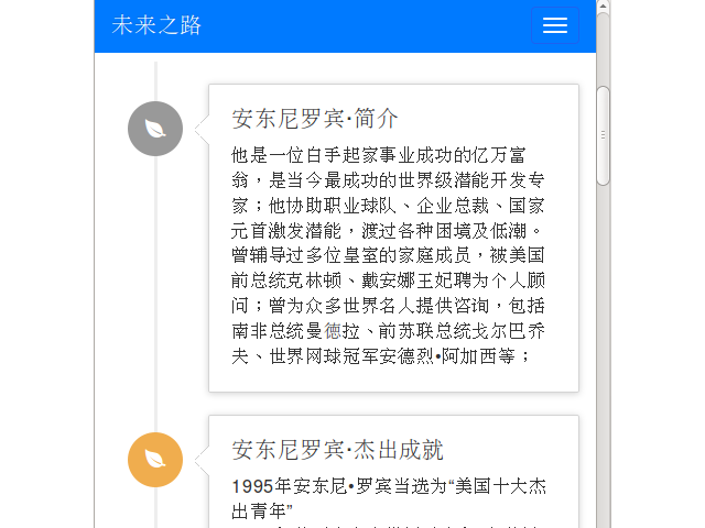
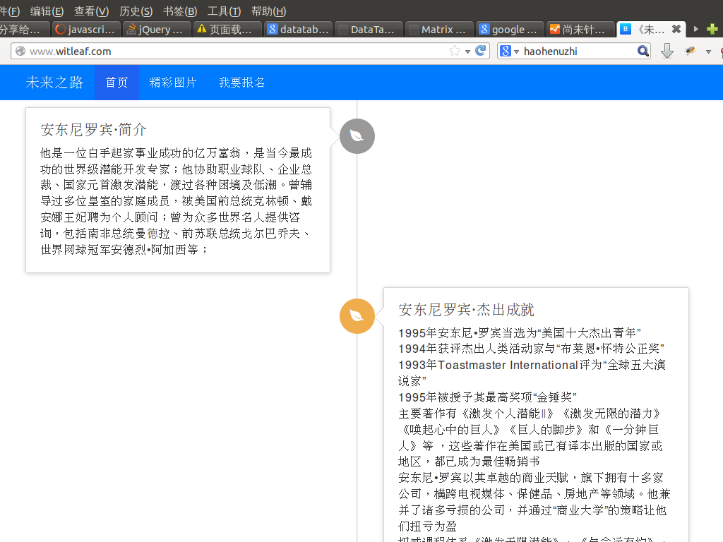
<h4 class="timeline-title">安东尼罗宾·简介</h4>
<p><small class="text-muted"><i class="glyphicon glyphicon-time"></i></small></p>
</div>
<div class="timeline-body">
<p>他是一位白手起家事业成功的亿万富翁,是当今最成功的世界级潜能开发专家;他协助职业球队、企业总裁、国家元首激发潜能,渡过各种困境及低潮。曾辅导过多位皇室的家庭成员,被美国前总统克林顿、戴安娜王妃聘为个人顾问;曾为众多世界名人提供咨询,包括南非总统曼徳拉、前苏联总统戈尔巴乔夫、世界网球冠军安德烈•阿加西等;
</p>
</div>
</div>
</li>
<li>......................</li>
</ul>
做的过程中发现Android 4.0 上对width: -webkit-calc(100% - 90px); 支持得不是很好,时间线显示不正常,后来用JS来解决了
 $(function() {
   $(window).resize(function() {
      initTimePanelSize();
   });
    initTimePanelSize();
    function initTimePanelSize(){
       width = $(this).width();
       //alert(width);
       if (width <= 767) {
         $('div.timeline-panel').width($(this).width() - 90);
       } else {
         $('div.timeline-panel').css('width', '46%');
       }
     }
 });
效果图:
以上就是bootstrap3响应式网站关键制作代码,希望能给大家一个参考,也希望大家多多支持脚本之家。
相关文章
- 这篇文章主要介绍了Bootstrap Table使用整理(二)的相关资料,需要的朋友可以参考下...2017-06-15
基于BootStrap Metronic开发框架经验小结【八】框架功能总体界面介绍
这篇文章主要介绍了基于BootStrap Metronic开发框架经验小结【八】框架功能总体界面介绍 的相关资料,需要的朋友可以参考下...2016-05-14- 这篇文章主要为大家分享了Bootstrap教程JS插件滚动监听学习笔记,内容很详细,感兴趣的小伙伴们可以参考一下...2016-05-20
- 这篇文章主要教大家如何利用Bootstrap3制作图片轮播效果,具有一定的参考价值,感兴趣的小伙伴们可以参考一下...2016-05-14
- 这篇文章主要为大家详细解析了BootStrap栅格系统、表单样式与按钮样式源码,具有一定的参考价值,感兴趣的小伙伴们可以参考一下...2017-01-23
基于BootStrap Metronic开发框架经验小结【六】对话框及提示框的处理和优化
这篇文章主要介绍了基于BootStrap Metronic开发框架经验小结【六】对话框及提示框的处理和优化的相关知识,主要对比说明在Bootstrap开发中用到的这些技术要点,对此文感兴趣的朋友一起学习吧...2016-05-14- 这篇文章主要为大家详细解析了BootStrap图片样式、辅助类样式和CSS组件源码,具有一定的参考价值,感兴趣的小伙伴们可以参考一下...2017-01-23
- 在网页中,经常见到进度条效果,那么这些个性的进度条组件效果是怎么实现的呢,下面脚本之家小编给大家分享Bootstrap进度条组件知识详解,感兴趣的朋友要求学习吧...2016-05-04
JS树形菜单组件Bootstrap TreeView使用方法详解
这篇文章主要为大家详细介绍了js组件Bootstrap TreeView使用方法,本文一部分针对于bootstrap的treeview的实践,另一部分是介绍自己写的树形菜单,具有一定的参考价值,感兴趣的小伙伴们可以参考一下...2017-01-09- 这篇文章主要为大家详细介绍了Bootstrap选项卡学习笔记,具有一定的参考价值,感兴趣的小伙伴们可以参考一下...2017-02-19
基于Bootstrap的Metronic框架实现页面链接收藏夹功能
本文给大家介绍基于Metronic的Bootstrap开发框架实现页面链接收藏夹功能,非常不错,具有参考借鉴价值,感兴趣的朋友一起学习吧...2016-09-01基于BootStrap的Metronic框架实现页面链接收藏夹功能按钮移动收藏记录(使用Sortable进行拖动排序)
这篇文章主要介绍了基于BootStrap的Metronic框架实现页面链接收藏夹功能按钮移动收藏记录(使用Sortable进行拖动排序)的相关资料,非常不错,需要的朋友可以参考下...2016-09-01- Bootstrap 是一个用于快速开发 Web 应用程序和网站的前端框架,主要基于 HTML、CSS、JAVASCRIPT 的。接下来通过本文给大家介绍BootStrap 附加导航组件的知识,感兴趣的朋友一起学习吧...2016-07-29
- 这篇文章主要为大家详细介绍了Bootstrap树形控件使用方法,感兴趣的小伙伴们可以参考一下...2016-01-29
- 这篇文章主要介绍了BootStrap和jQuery相结合实现可编辑表格的相关资料,需要的朋友可以参考下...2016-04-23
- 这篇文章主要介绍了Bootstrap Table使用整理(四)之工具栏的相关资料,需要的朋友可以参考下...2017-06-15
BootStrap Progressbar 实现大文件上传的进度条的实例代码
这篇文章主要介绍了BootStrap Progressbar 实现大文件上传的进度条的实例代码的相关资料,非常不错,具有参考借鉴价值,需要的朋友可以参考下...2016-07-01- 本文通过实例代码给大家介绍了bootstrap导航条效果,代码简单易懂,非常不错,具有参考借鉴价值,需要的的朋友参考下吧...2017-05-22
- bootstrap布局是应用得很广泛的一种网页布局方法,下面通过本文给大家介绍bootstrap页面缩小变形的快速解决办法,需要的朋友参考下吧...2017-02-08
Bootstrap中文本框的宽度变窄并且加入一副验证码图片的实现方法
这篇文章主要介绍了Bootstrap中文本框的宽度变窄并且加入一副验证码图片的实现方法的相关资料,非常不错,具有参考借鉴价值,需要的朋友可以参考下...2016-06-24