纯CSS3制作的鼠标悬停时边框旋转的教程
更新时间:2017年1月22日 11:03 点击:2169
小编推荐的这篇文章介绍了纯CSS3制作的鼠标悬停时边框旋转的教程,实例非常好看,有兴趣的同学可以动手尝试一下
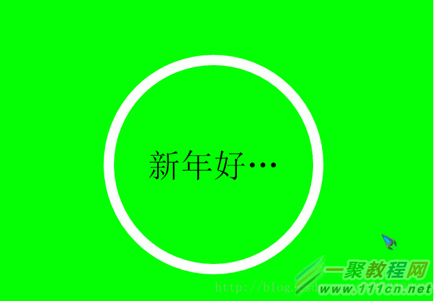
下面以2017年新年祝福语为例给大家展示下效果。
纯CSS3实现的鼠标悬停时边框旋转的效果:
实现代码如下,代码中注释已经比较详细,就不再多说了:
| 代码如下 | 复制代码 |
|
<!DOCTYPE html>
<html lang="en">
<head>
<meta charset="UTF-8">
<title>Document</title>
<style type="text/css">
body {
width:40rem;
height:30rem;
font-size:62.50%; /* 把body的字体设置为10px以方便使用rem时的计算 */
}
.container {
width:100%;
height:100%;
background:#0f0;
text-align:center;
}
/* 设置content元素的属性 */
/* 此元素的宽和高必须相等,即设置border-radius: 50%;后应该是一个圆 */
/* 使用rem相对于body的字体尺寸设置了宽和高 */
.content {
display: inline-block;
margin-top:5rem;
width:20rem;
height:20rem;
border:solid15pxrgba(255,255,255,1); /* 此处设置边框,使用rgba的方式是为了后面隐藏时方便,只需要设置a的值为0即可隐藏 */
border-radius:50%;
box-sizing: border-box; /* 使用此属性防止边框撑开盒子,border-box会让边框占用盒子里面的空间 */
transition:all2s; /* 该元素的所有属性的变化会在2s内完成 */
}
/* 使用伪类before设置需要转动的边框 */
/* 因为如果元素边框转动,内容也会跟着转动 */
/* 此处要的效果是只有边框转动而内容不转动 */
.content:before {
display: inline-block;
width:100%;
height:100%;
border-radius:50%;
box-sizing: border-box;
content:'';
}
/* 设置鼠标悬停在content元素上时content属性的变化 */
.content:hover {
/*border: solid 15px rgba(255, 255, 255, 0);*/
}
/* 设置鼠标悬停在content上时content的before伪类属性的变化 */
.content:hover:before {
border:dashed30px#fff;
animation: whirl9s linear infinite; /* 执行动画whirl,执行一次的周期是9s,执行期间的速度曲线为linear,无限循环 */
}
/* 设置文本内容显示的样式 */
.con-text {
margin:-60%auto;
width:80%;
font-size:3rem;
/* 以下三个属性为了让文字超出宽度时显示省略号,必须同时使用才有效果 */
overflow:hidden;
white-space:nowrap;
text-overflow: ellipsis;
}
/* 动画whirl,从0度旋转到360度 */
@keyframes whirl {
from {
transform: rotate(0deg);
}
to {
transform: rotate(360deg);
}
}
</style>
</head>
<body>
<section class="container">
<div class="content"title="新年好新年好新年好">
<p class="con-text">新年好新年好新年好</p>
</div>
</section>
</body>
</html>
| |
相关文章
- 代码如下:$('#<%=AllEvent.ClientID%> tr:not(:has("th"))').hover(function () { $bg = $(this).css('background-color'); $(this).css('background-...2013-10-03
- 鼠标划过实现延迟加载并隐藏层的js代码...2013-10-13
- 这篇文章主要介绍了C#模拟window操作鼠标的方法,可实现模拟鼠标移动到固定位置后点击右键的功能,涉及鼠标常用事件的操作技巧,需要的朋友可以参考下...2020-06-25
- 这篇文章主要介绍了js实现文字垂直滚动和鼠标悬停效果,具有一定的参考价值,感兴趣的小伙伴们可以参考一下...2016-01-05
- 本文实例讲述了JS实现网页游戏中滑块响应鼠标点击移动效果。分享给大家供大家参考,具体如下:这是网页游戏中的一个有趣效果,可以完成以下几个动作:滚动、scroll 8个方向、鼠标坐标获娶对象上下左右位置获取,大家可以自己添...2015-10-21
- 这篇文章主要介绍了C#通过重写Panel改变边框颜色与宽度的方法,涉及C#针对Panel控件的重写与属性设置技巧,具有一定参考借鉴价值,需要的朋友可以参考下...2020-06-25
- 这篇文章主要介绍了基于JavaScript获取鼠标位置的各种方法 ,需要的朋友可以参考下...2015-12-18
- 下面小编就为大家带来一篇C#获取鼠标在listview右键点击单元格的内容方法。小编觉得挺不错的,现在就分享给大家,也给大家做个参考。一起跟随小编过来看看吧...2020-06-25
- 今天小编在这里就来给Photoshop的这一款软件的使用者们来说下用鼠标绘制一颗一星龙珠的教程,各位想知道具体绘制方法的使用者们,那么下面就快来跟着小编一起看一看吧。...2016-09-14
- 今天小编在这里就来给各位photoshop的这一款软件的使用者们来说下画出完美圆弧的波浪线边框教程,各位想知道具体制作方法的,那么下面就快来跟着小编一起看一看教程吧。...2016-09-14
- 这篇文章主要介绍了unity 判断鼠标是否在哪个UI上的两种实现方法,具有很好的参考价值,希望对大家有所帮助。一起跟随小编过来看看吧...2021-04-10
- 这篇文章主要介绍了C#简单获取全屏中鼠标焦点位置坐标的方法,涉及C#针对鼠标位置Position属性的简单操作技巧,需要的朋友可以参考下...2020-06-25
- 这篇文章主要介绍了JavaScript鼠标悬停事件用法解析,文中通过示例代码介绍的非常详细,对大家的学习或者工作具有一定的参考学习价值,需要的朋友可以参考下...2020-05-15
JS清除文本框内容离开在恢复及鼠标离开文本框时触发js的方法
多网站的需要填写的文本框在默认状态下都会给出一个默认的提示语言,当鼠标点击此文本框的时候能够将里面的默认文本清除,当删除输入的文本且焦点离开文本框的时候再将默认的文本写入文本框...2016-01-14- 这篇文章主要为大家详细介绍了JS实现鼠标按下拖拽效果,文中示例代码介绍的非常详细,具有一定的参考价值,感兴趣的小伙伴们可以参考一下...2020-07-24
html+css+js实现canvas跟随鼠标的小圆特效源码
这篇文章主要介绍了html+css+js实现canvas跟随鼠标的小圆特效源码,本文给大家介绍的非常详细,对大家的学习或工作具有一定的参考借鉴价值,需要的朋友可以参考下...2021-03-15- 这篇文章主要为大家详细介绍了unity3D实现三维物体跟随鼠标,文中示例代码介绍的非常详细,具有一定的参考价值,感兴趣的小伙伴们可以参考一下...2020-06-25
- 这篇文章主要介绍了C#实现鼠标移动到曲线图上显示值的方法,是C#的WinForm窗体程序设计中非常实用的技巧,需要的朋友可以参考下...2020-06-25
- 这篇文章主要介绍了Delphi实现窗体感知鼠标滑过并自动隐藏与显示窗口的方法,涉及Delphi操作窗口及鼠标事件的技巧,需要的朋友可以参考下...2020-06-30
- 今天小编在这里就来教Photoshop的这一款软件的使用者们用鼠标绘制金属手表的教程,各位想知道到底该怎么绘制的使用者们,那么下面就快来跟着小编一起看一看教程吧。 ...2016-09-14